The Image widget allows you to add, modify, and display images on your website. The widget provides a simple solution for your website product visuals.
Adding an Image Widget
To add an Image widget to your website:
- Go to Visual Editor by selecting Advanced mode from the mode switcher on the Dashboard top panel, or navigate to Dashboard > Channels > Advanced.
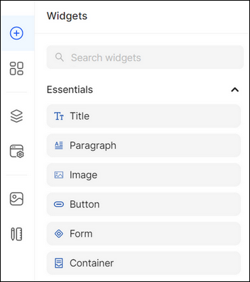
- Open the Widgets list on the left panel.
- Type the widget name in the search bar, or find it in the Essentials/Media grouping and select the Image widget.
Drag and drop the Image widget from the list onto the desired crafting area of the Layout Canvas.
Configuring the Image Widget
Once you have added the Image widget, click the widget to activate the Property Panel where you can customize its Styles, Content, and Settings according to your preferences.
To configure the Image widget:
- Go to Styles to customize the widget styling features (see Global Styles).
2. Go to Content to configure the widget content:
- Click Change Image and select the corresponding image in the Media popup that opens, or upload the media content from the computer, free stock (powered by Unsplash), or URL.
Note: The supported file types are JPEG, PNG, GIF, SVG, WebP, and TIFF. - Select how the image is resized and fitted within its container from the Object Fit drop-down list:
- Cover: The image is scaled to cover the entire container, filling it without any letterboxing.
- Contain: The image is scaled to fit within the container while maintaining its aspect ratio.
Fill: The image stretches to fill the entire container, potentially causing distortion if the aspect ratio is not maintained.
The Object Fit pointer or cursor allows you to specify which part of an image is displayed or highlighted. The Object Fit properties are used to control the image replacement and position, supporting cases where, especially, the aspect ratio differs from the container aspect ratio.
- Enter the Alt text.
- Expand Link and click Add Link to add clickable phone numbers and email addresses or navigate your customers to your website's Main or System pages, products, collections, or collection items. You can redirect your users to external and internal websites, allowing your customers to navigate to specific destinations in a new tab or by replacing the current tab.

3. Go to Settings to modify the widget settings:
- Select the image loading type:
- Lazy Loading: Ensures that product images are only loaded when they are about to be displayed on the user's screen. When a customer visits a product page, only the images initially visible or near the viewport are loaded immediately. As the user scrolls down or interacts with the page, additional images are loaded dynamically, typically as they come into view.
- Preload: Ensures that product images are loaded in advance before they are needed. Image preload involves fetching and storing product images in the user's browser cache so that they can be quickly displayed when the user navigates to a product page or interacts with a product gallery.
Note: By default Lazy Load is selected.
- Choose the fetch priority of the image if the Preload loading type is selected. The following options are available:
- Low: These images aren't prioritized for immediate loading and may be fetched after higher-priority resources are loaded.
- High: These images are prioritized for immediate loading and fetched as soon as possible to enhance user experience.
- Auto: The system dynamically determines the fetch priority based on preload/lazy load settings.
- Expand Visibility to modify the visibility of the widget on your website. Select who can view the widget according to the customer’s location, session status, type of used device, browser, language preference, etc. (see Visibility Settings).

Tip:
- You can also access the UI Elements in the Design System. To do so, click the bookmark icon in the upper-right corner of the Property Panel. Select one as a base for the widget, or click the plus icon to create a new UI Element and style it according to your preferences.
- Once you have customized each mode, you can use the Dotted Menu to reset or override the widget styles. To do so:
- Click the Dotted Menu in the right corner of the Property Panel.
- Select Reset Styles to discard the changes made to the widget and restore its default style.
- Select Override Styles to update the default style of the base element (font, size, alignment, etc.) and the elements derived from the base one.

💡 If you have questions or concerns, contact us directly via the Live Chat box in the lower right corner. Our Support Team will provide you with top-notch quality support 24/7.