A visual component that is essential to user interaction is a Button widget. The Button widget provides easy navigation by redirecting users to different pages or other sections on the website. The widget provides the ability to initiate a number of actions, including form submissions, confirmation requests, and command executions. CTAs encourage user interaction and prompt them through your website.
Adding a Button Widget
To add a Button widget to your website:
- Go to Visual Editor by selecting Advanced mode from the mode switcher on the Dashboard top panel, or navigate to Dashboard > Channels > Advanced.
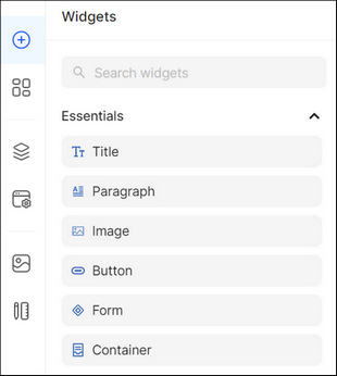
- Open the Widgets list on the left panel.
- Type the widget name in the search bar, or expand the Essentials grouping and select the Button widget.
Drag and drop the Button widget from the list onto the desired crafting area of the Layout Canvas.
Configuring the Button Widget
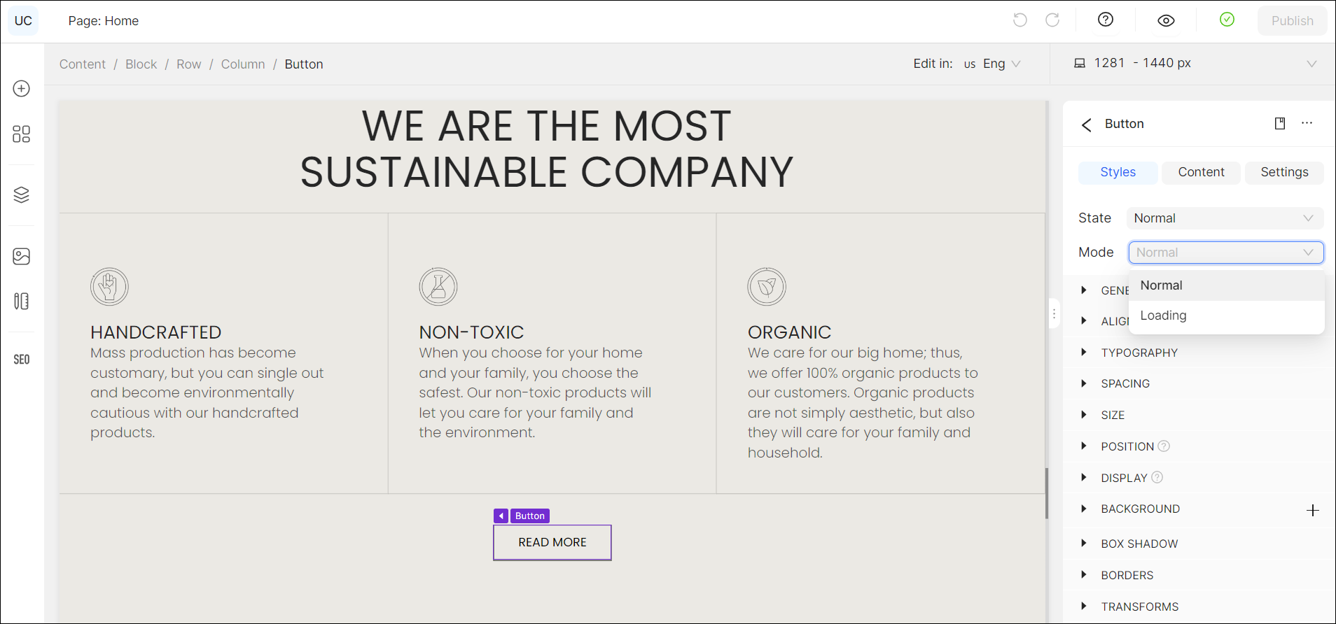
Once you have added the widget to the crafting area, you can modify the Button widget properties from the Property Panel according to your preferences. The properties of the Button widget include Styles, Content, and Settings. Each Button comes from the design preset, where you can customize them in Design System > UI Elements, and each has its own state.
To configure the Button widget:
- Go to Styles to modify the widget styling features:
- Set the CSS design framework States - Normal, Hover, Active, Disabled, and Selected (see Global Styles > State).
- Make the necessary configuration of principal styling features from the Property Panel (see Global Styles). Global Styles are a set of predefined style settings that can be applied to widgets across the website. They provide a constant appearance by defining default styles for all the widget types.
- Define the types of buttons: Label Only, Left Icon, Right Icon, Icon Only.
2. Go to Content to modify the button content, specifically:
- Add a Link to redirect your customers to certain websites, Main or System pages, products, collections, or collection items, and headings, making them clickable for easy access.
- You can enhance customer engagement by adding clickable phone numbers and email addresses.
- Change the icon. Icon allows you to add or change the icon next to the item that best suits your website design. To do so:
- Click Change Icon.
- Go to General Icons and select the corresponding icon from the list.
- Go to My Icons and select the corresponding icon from the list uploaded in Media> Vectors.
- Edit the button text/label.
3. Go to Settings and expand Visibility to modify the widget visibility on your website. Select who can view the widget according to the customer’s location, session status, type of used device, browser, language preference, etc. (see Visibility Settings).
Modifying the Widget States
You can set the state of the Button widget to define how it is displayed on your website based on user actions.
The following modes are available:
- Normal: Allows you to create the static state of the widget for the public mode, referring to the state of the widget when it is not affected by any interaction.
- Loading: Allows you to create the state and the design of the button once it is clicked on and the loading process takes place.
The modes are essential for defining widget behavior and enabling it to display other views depending on its current state. For instance, you could wish to offer several choices for a loading state, customizing the widget look and feel across the website.
Tip:
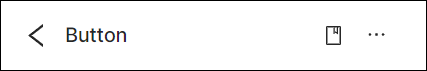
- You can access the UI Elements in the Design System. To do so, click the bookmark icon in the upper-right corner of the Property Panel. Select one as a base for the widget, or click the plus icon to create a new UI Element and style it according to your preferences.
- Once you have customized each mode, you can use the Dotted Menu to reset or override the widget styles. To do so:
- Click the Dotted Menu in the right corner of the Property Panel.
- Select Reset Styles to discard the changes made to the widget and restore its default style.
- Select Override Styles to update the default style of the base element (font, size, alignment, etc.) and the elements derived from the base one.
💡 If you have questions or concerns, contact us directly via the Live Chat box in the lower right corner. Our Support Team will provide you with top-notch quality support 24/7.